
Social Media Image Sizes and Best Times to Post in 2026
A post can fail before anyone has even considered the idea behind it.
The headline gets clipped in a profile grid. A product disappears behind an interface button. A landscape graphic takes up so little of a phone screen that the text is unreadable. A thumbnail that looked sharp at full size turns to mush at the size people actually see it. Or the whole thing goes live while most of the intended audience is asleep.
None of those are creative failures. They’re production failures, and every one of them is avoidable. This is the guide I wish I could hand to every person who has ever exported a beautiful graphic at the wrong dimensions and watched it die in the feed.
What follows is the recommended image sizes, video dimensions, aspect ratios, profile assets and starting posting windows for 17 major platforms, verified as of July 2026. It’s built for creators, social managers, founders and marketing teams who want a reference they can trust rather than another wall of numbers with no explanation attached. We originally made most of this as a carousel for our Instagram (@BeingAiReady if you want the poster versions to save), and the platform cards from that carousel are scattered through this post: screenshot-friendly, one per network.
Quick answer: Build from a few master canvases and adapt from there. Portrait feed posts are 1080 × 1350 (4:5), full-screen vertical video is 1080 × 1920 (9:16), landscape video is 1920 × 1080 (16:9), and link previews are 1200 × 630 (1.91:1). Keep the important stuff inside a centred square so crops don’t destroy it. For timing, there is no universal best hour. Tuesday and Wednesday afternoons are a strong broad starting point, but the real answer comes from four to six weeks of your own analytics, measured against the goal of the post rather than its likes.
The one distinction that will save you the most grief
Before any of the numbers, hold onto this, because it explains why half of what you read about “the best time to post” contradicts the other half:
Dimensions are technical constraints. Posting times are testable hypotheses.
A 9:16 Story genuinely needs a vertical canvas if you want to use the screen properly. That’s not up for debate; it’s how the viewport works. But a claim that 3 p.m. is the universal best time to publish is a much softer thing. Timing studies look at different accounts, industries, countries, formats and success metrics, so two perfectly credible datasets can land on different answers without either one being wrong.
The move isn’t to ignore timing research. It’s to use the broad studies to pick a sensible first experiment, then throw the benchmark away the moment your own account has enough data to replace it.
The quick answer: three master canvases cover most of the work
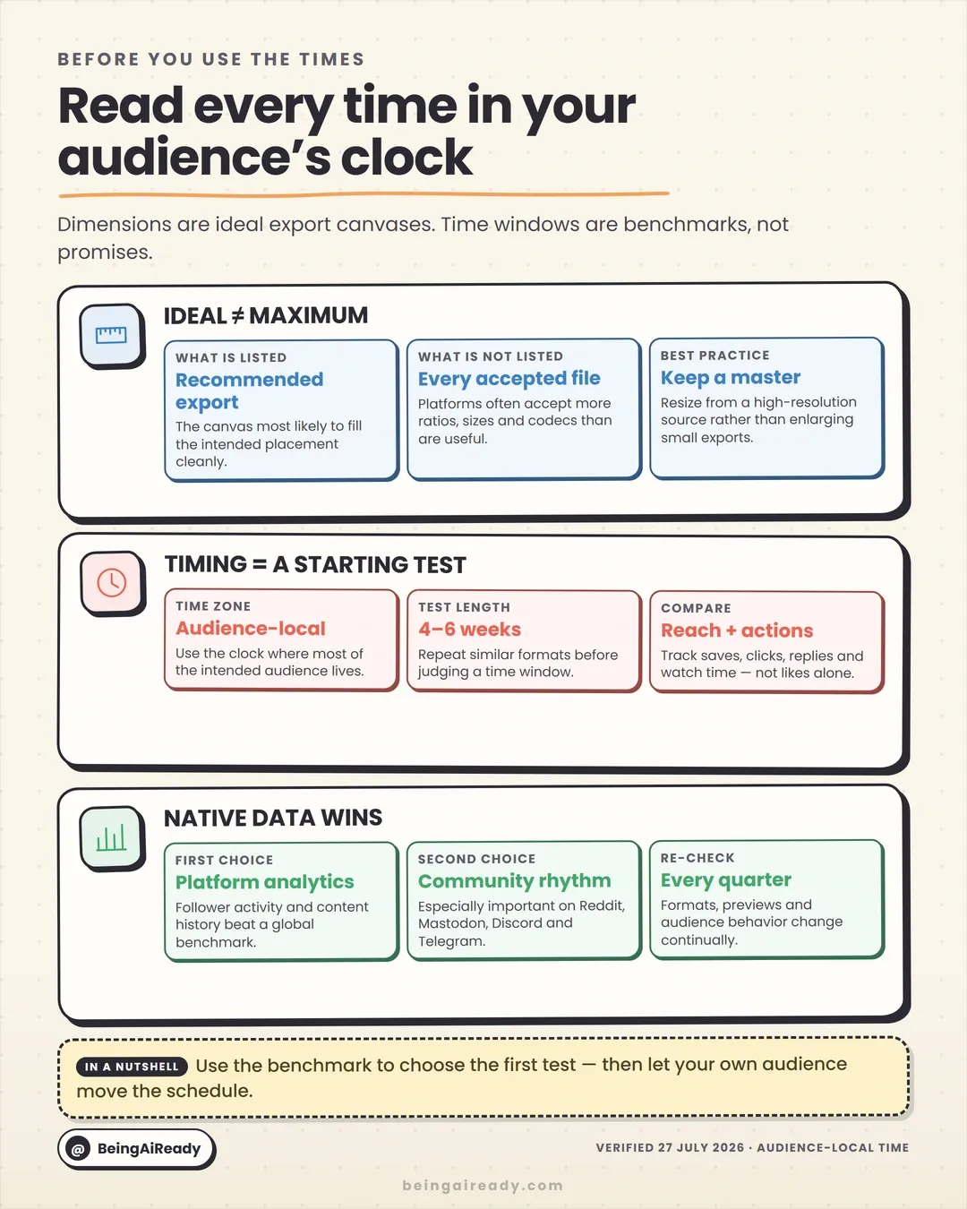
A small team does not need a fresh blank document for every network. Start with three reusable masters, and you’ve covered the overwhelming majority of what you’ll ever export:
| Master canvas | Aspect ratio | What it’s for |
|---|---|---|
| 1080 × 1350 px | 4:5 | Portrait feed posts, carousels and explainers on Instagram, Facebook, LinkedIn, Threads, X, Reddit and channel-style platforms |
| 1080 × 1920 px | 9:16 | Reels and Stories, Facebook Stories, TikTok, Shorts, Snapchat, WhatsApp Status and vertical video |
| 1920 × 1080 px | 16:9 | YouTube, Twitch, landscape video, presentations, webinars and video previews |
There’s a fourth size you’ll export constantly: the 1200 × 630 px (1.91:1) link card for website previews, Facebook links and open-graph images. I list it separately below because you’ll reach for it all the time, but it’s really just a wide crop of the landscape master rather than a canvas you design from scratch.
Then keep a 1080 × 1080 px square-safe area inside your portrait graphics. A square crop still shows up everywhere: profile previews, multi-image layouts, embeds, automated placements. The point isn’t to centre every element like a nervous designer. It’s to keep the logo, headline, face and main object from getting guillotined the second a platform decides to re-crop your work.
The 30-second reference: every platform’s size and first timing test
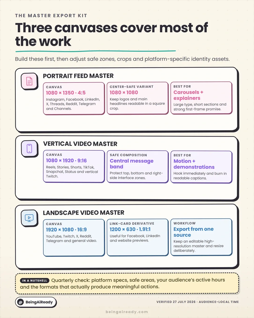
Times below use the intended audience’s local clock unless noted. They’re starting points, not promises; the platform sections further down explain the reasoning behind each one.
| Platform | Recommended feed / primary media | Full-screen vertical | Sensible first timing test |
|---|---|---|---|
| 1080 × 1350 (4:5); 1080 × 1440 (3:4 photo) | 1080 × 1920 | Tue–Wed, 12–7 p.m.; test Thu morning separately | |
| 1080 × 1350 (4:5); links 1200 × 630 | 1080 × 1920 | Tue–Wed, 12–8 p.m.; challenge with Wed–Thu, 8–10 a.m. | |
| YouTube | Video 1920 × 1080; thumbnail 3840 × 2160 | Shorts 1080 × 1920 | Long-form: Sun morning and Sun–Tue evening; Shorts: Fri, 4–7 p.m. |
| TikTok | 1080 × 1920 | 1080 × 1920 | Tue–Thu afternoons vs Sat–Sun windows |
| X / Twitter | 1280 × 720 landscape; 1080 × 1080 square | 1080 × 1920 | Weekday 8–11 a.m. vs Tue–Thu 12–6 p.m. |
| 1200 × 1500 or 1080 × 1350 portrait | 1080 × 1920 video | Tue–Thu, 11 a.m.–5 p.m.; lean on 3–5 p.m. | |
| 1000 × 1500 (2:3) | 1080 × 1920 | Tue–Thu, 8 a.m.–1 p.m. | |
| Snapchat | 1080 × 1920 | 1080 × 1920 | Start 6–9 p.m.; move to native analytics fast |
| Threads | 1440 × 1920 (3:4) or 1080 × 1350 | 1080 × 1920 | Wed noon or Thu 9–11 a.m. |
| Bluesky | 1200 × 1500, 1200 × 1200 or 1600 × 900 | 1080 × 1920 | Weekend 5–9 p.m.; Sunday ~5 p.m. is a useful test |
| 1080 × 1350 or 1200 × 628 | 1080 × 1920 | Post 30–60 min before the subreddit wakes up | |
| Mastodon | 1080 × 1350, 1080 × 1080 or 1920 × 1080 | 1080 × 1920 | 8–11 a.m. and 6–9 p.m. in follower-local time |
| Status 1080 × 1920; Channels 1080 × 1350 | 1080 × 1920 | Utility 7–9 a.m. or noon; community 6–9 p.m. | |
| Telegram | Channel 1080 × 1350 or 1280 × 720 | Stories 1080 × 1920 | Utility 8–10 a.m.; community 6–9 p.m. |
| Discord | Banner 960 × 540; media 1200 × 675 or 1080 × 1350 | 1080 × 1920 where useful | Schedule from Server Insights, not a global average |
| Twitch | Stream 1920 × 1080; vertical companion 1080 × 1920 | 1080 × 1920 | Go live before the category peak; test weekday evenings |
| Tumblr | Master 1280 × 1920; large image up to 2048 × 3072 | 1080 × 1920 | Start 5–8 p.m.; fandom and live-event timing often wins |
Five words worth defining before you use any size chart
Most sizing arguments online are really vocabulary problems in disguise. Five terms clear up almost all of them.
Aspect ratio
This is the shape of the frame, not its sharpness. A 4:5 graphic is four units wide for every five tall, so both 1080 × 1350 and 1440 × 1800 count as 4:5. Platforms care about shape because shape decides how the post drops into a feed, a Story viewer or a grid. A bigger file with the wrong shape gets cropped harder than a smaller file with the right one.
Pixel dimensions
The actual width and height of the exported file. They affect detail, text clarity and how much room the platform has to resize you. Bigger isn’t automatically better. Upload an enormous file and all you’ve done is hand the compressor more to chew on, with no benefit the viewer will ever see. The sizes here are practical: big enough to stay crisp after compression, not so big they slow everything down.
Resolution
In social-media land, “resolution” gets used loosely to mean pixel dimensions, and the print-world instinct about 300 DPI is mostly irrelevant here. A 1080 × 1350 image is 1080 × 1350 whether its metadata claims 72 DPI or 300. For anything going on a screen, worry about pixel dimensions, aspect ratio, compression and file format instead.
Safe zone
The part of the canvas where the essential information has to survive after interface overlays and preview crops land on top of it. A 1080 × 1920 video can be technically perfect and still badly designed, because Reels, TikTok, Shorts and Snapchat all pile captions, handles, buttons and navigation around the edges. Keep the main face, product and headline in a central band and let the outer edges carry background and decoration. And do check the real post before publishing, because interfaces move and paid placements add their own buttons.
Recommended size vs maximum accepted size
A platform will happily accept far more ratios, sizes and codecs than it actually displays well. This guide gives you the recommended export canvas, not the outer limit of what the upload form tolerates. “It accepted the file” and “it presented the file clearly” are two very different claims.
Why the timing studies never agree
Here’s the thing that trips people up: when two reputable timing studies disagree, it usually isn’t because one of them is wrong. It’s because they’re measuring different things.
Sprout Social’s 2026 aggregate data finds engagement is generally strongest on Tuesdays and Wednesdays from late morning through the afternoon, with platform-specific windows stretching into the evening. Buffer’s 2026 studies, built from tens of millions of posts, pick out several different peaks: weekday mornings on X and Facebook, evenings on Instagram, weekend mornings on TikTok, Sunday mornings for long-form YouTube. Both can be true at once, because they’re built on different samples, platforms, metrics and normalisation.
Timing data bends around at least six variables:
- The outcome being measured. Reach, likes, replies, click-through, saves, watch time and purchases don’t all peak at the same hour.
- The type of account. A local restaurant, a B2B software company, a news desk and an entertainment creator run on completely different clocks.
- Audience geography. A global, English-language account has no single local evening.
- Content format. Long-form video and short clips are consumed differently. A LinkedIn document and an event announcement behave differently too.
- Distribution mechanics. Some feeds are heavily ranked; others are chronological, community-specific or shaped by user-chosen feeds.
- Selection bias. A scheduling tool’s dataset reflects the people who use that scheduling tool.
So use the benchmarks to pick two or three plausible windows to test. Don’t rebuild your whole content operation around a single square on somebody’s heatmap.
What follows is the platform-by-platform detail: recommended dimensions, safe zones and starting posting windows, with the reasoning attached so you can adapt it rather than copy it blind.
Instagram image sizes, Reel dimensions and best posting times
Instagram makes you think about three viewing contexts at once now: the feed, the profile grid and full-screen vertical.
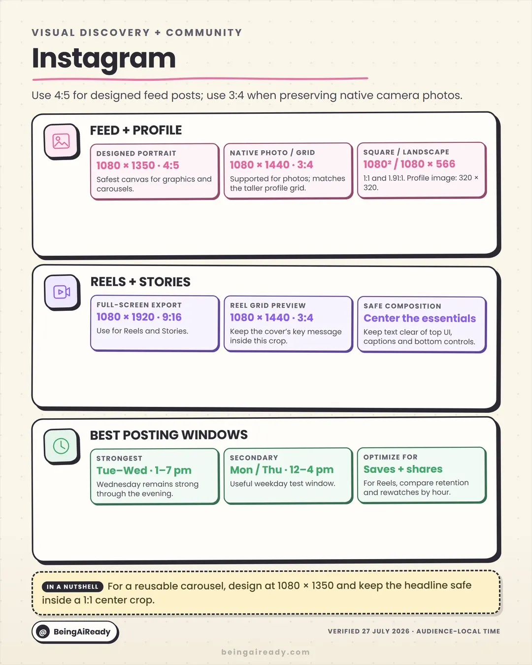
For designed carousels, explainers and promo graphics, 1080 × 1350 px at 4:5 is still the safest general-purpose feed canvas. It takes up a lot of mobile screen and travels cleanly to Facebook, LinkedIn and the text-first platforms. Instagram also supports taller 3:4 photos, and the profile grid now previews in that taller shape rather than the old square. A 1080 × 1440 px canvas is handy when you’re preserving camera-native photography or designing specifically for the newer grid. It’s less convenient as a universal master, though, which is why 4:5 stays the default for reusable branded graphics.
Recommended Instagram dimensions
| Asset | Recommended size | Ratio | Note |
|---|---|---|---|
| Designed portrait post / carousel | 1080 × 1350 | 4:5 | Best reusable feed master |
| Taller photo / grid asset | 1080 × 1440 | 3:4 | Good for photography and the taller grid preview |
| Square post | 1080 × 1080 | 1:1 | Still reliable, uses less vertical space |
| Landscape post | 1080 × 566 | 1.91:1 | Only when the composition genuinely needs the width |
| Reel | 1080 × 1920 | 9:16 | Keep key content clear of the interface edges |
| Story | 1080 × 1920 | 9:16 | Full-screen vertical |
| Profile image | 320 × 320 or larger square | 1:1 | Shows as a circle — don’t rely on corners |
The Reel cover deserves its own attention. The Reel itself is 9:16, but its grid preview is cropped, so keep the title and focal subject inside the central 3:4 region and actually look at the cover at thumbnail size before you publish.
Best time to post on Instagram in 2026
There’s no consensus hour. Sprout’s 2026 study finds broad strength across Monday afternoon, Tuesday from early afternoon into evening, Wednesday from noon onward and Thursday around midday. Buffer’s July 2026 analysis calls Wednesday strongest overall, with peaks at noon and 6 p.m., a strong Tuesday mid-afternoon-to-evening, and, oddly, a Thursday morning spike.
A practical starting schedule:
- Primary test: Tuesday and Wednesday, 12–7 p.m.
- Challenger: Thursday morning, 8–9 a.m. (chasing that Buffer spike).
- For Reels: compare evening against midday using retention, rewatches and shares, not likes.
For an educational carousel, saves and shares tell you more than first-hour likes. For a Reel, the opening-second hold rate matters more than either. The “best time” shifts when the metric shifts.
Sources: Instagram size guidance (Buffer) · Sprout’s Instagram timing study
Facebook image sizes, Reel dimensions and best posting times
Facebook is a mixed bag of placements: main feed, Pages, Groups, recommendations, link previews, Reels. Its ongoing shift toward treating new videos as Reels makes vertical-safe production matter even though landscape and square are both still valid.
For organic feed graphics, 1080 × 1350 px is the most useful all-purpose size; it gives a brand post more presence than a landscape image and repurposes easily. Reach for 1200 × 630 px only when the website preview is the actual point and the headline lives in the link card.
Recommended Facebook dimensions
| Asset | Recommended size | Ratio | Note |
|---|---|---|---|
| Portrait feed post | 1080 × 1350 | 4:5 | Strong general-purpose organic format |
| Square post | 1080 × 1080 | 1:1 | Simple graphics, broad compatibility |
| Link / open-graph card | 1200 × 630 | 1.91:1 | Designed for the preview, not feed space |
| Reel or Story | 1080 × 1920 | 9:16 | Keep titles and faces centrally safe |
| Page profile image | 320 × 320 or larger square | 1:1 | Expect a circular display |
| Page cover | 851 × 315 reference | ~2.7:1 | Preview desktop and mobile crops |
Paid specs can differ from organic. Meta’s current ad docs support 1:1 and 4:5 for feed creative and recommend 9:16 for full-screen placements. So for anything important, upload placement-specific versions rather than trusting one automated crop to protect every logo.
Best time to post on Facebook in 2026
The two big 2026 datasets point in different, testable directions. Sprout finds a broad Tuesday–Wednesday, 12–8 p.m. window. Buffer’s analysis of 14 million posts finds stronger mornings, with Thursday at 9 a.m. the single best slot and Wednesday close behind.
So, for a Page starting from limited data: test Tuesday or Wednesday, noon–8 p.m. as one cohort and Wednesday or Thursday, 8–10 a.m. as another. For Groups and local communities, schedule around when members actually talk, since group rhythm routinely overwhelms Page-level averages. And measure outbound clicks, real comments, shares and conversions separately; a morning post can earn efficient engagement while an evening post earns more total reach.
Sources: Buffer’s Facebook timing research · Sprout’s Facebook timing research
YouTube video sizes, thumbnail dimensions and best publishing times
YouTube isn’t one format. Long-form, Shorts, thumbnails, banners and TV displays all want different things, and treating a thumbnail as a frame exported from the video is one of the most common self-inflicted wounds on the platform.
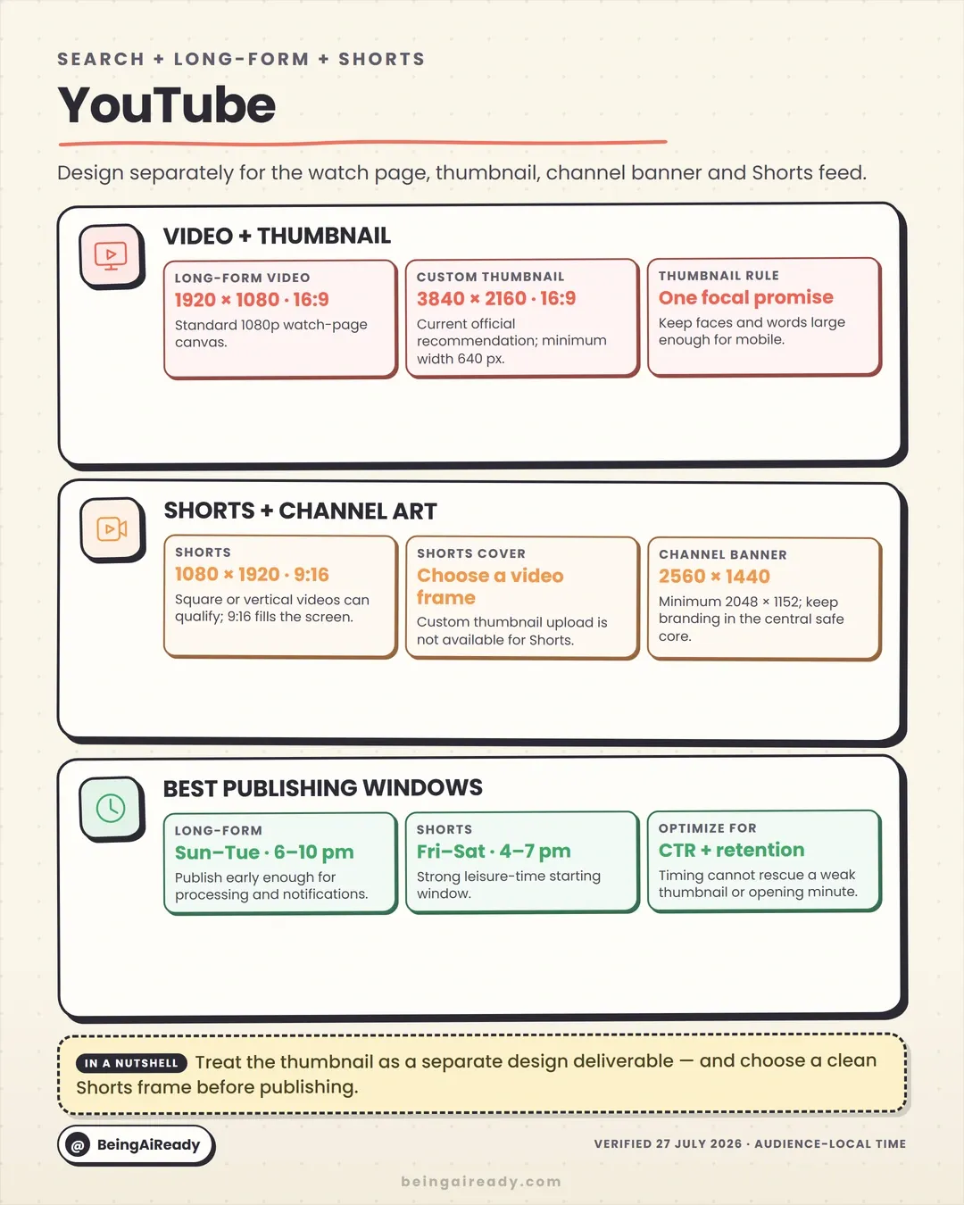
The standard long-form canvas is still 1920 × 1080 px at 16:9 for 1080p. The notable 2026 change is the thumbnail recommendation: YouTube now asks for 3840 × 2160 px at 16:9, minimum width 640 pixels. That does not mean a thumbnail needs microscopic detail. Quite the opposite. The file can be big, but the design still has to read when it’s shrunk to the size of a thumbnail on a phone.
Recommended YouTube dimensions
| Asset | Recommended size | Ratio | Note |
|---|---|---|---|
| Long-form video | 1920 × 1080 | 16:9 | Standard Full HD canvas |
| Custom thumbnail | 3840 × 2160 | 16:9 | Current recommendation; design for mobile size |
| Shorts | 1080 × 1920 | 9:16 | Square/vertical can qualify, but 9:16 fills the viewer |
| Shorts thumbnail | Pick a frame | — | No separate custom upload like long-form |
| Channel banner | 2560 × 1440 | 16:9 | Min 2048 × 1152; protect the central safe area |
| Channel profile image | High-res square | 1:1 | Displays small in a lot of places |
The banner shows up across phones, desktops and televisions, so most of that canvas is responsive background. Keep the channel name, promise and upload schedule inside the central safe core rather than spreading them across the full width.
Best time to publish on YouTube in 2026
This is where you’ll see me hedge, because the studies really do split here. Buffer’s July 2026 analysis, which sensibly separates long-form from Shorts, puts long-form’s strongest slot on Sunday morning, around 10 a.m., with nearby Sunday-morning and Tuesday-morning slots close behind. Other trackers favour Sunday-through-Tuesday evenings for the same content. For Shorts the pattern is cleaner: evenings dominate, with Friday at 4, 6 and 7 p.m. taking the top three spots.
Because long-form is contested, test both ends of it:
- Long-form: run a Sunday 9 a.m.–noon cohort against a Sunday–Tuesday 6–10 p.m. cohort and let your own retention data break the tie.
- Shorts: Friday 4–7 p.m., then test weekday evenings around 7–9 p.m.
- Upload early and schedule the release so processing, checks and captions are all done before it goes public.
Timing can’t rescue weak packaging. Judge long-form on thumbnail click-through, first-minute retention and average view duration; judge Shorts on viewed-versus-swiped, completion and repeat viewing.
Sources: YouTube thumbnail guidance · Buffer’s YouTube timing study
TikTok video dimensions, safe zones and best posting times
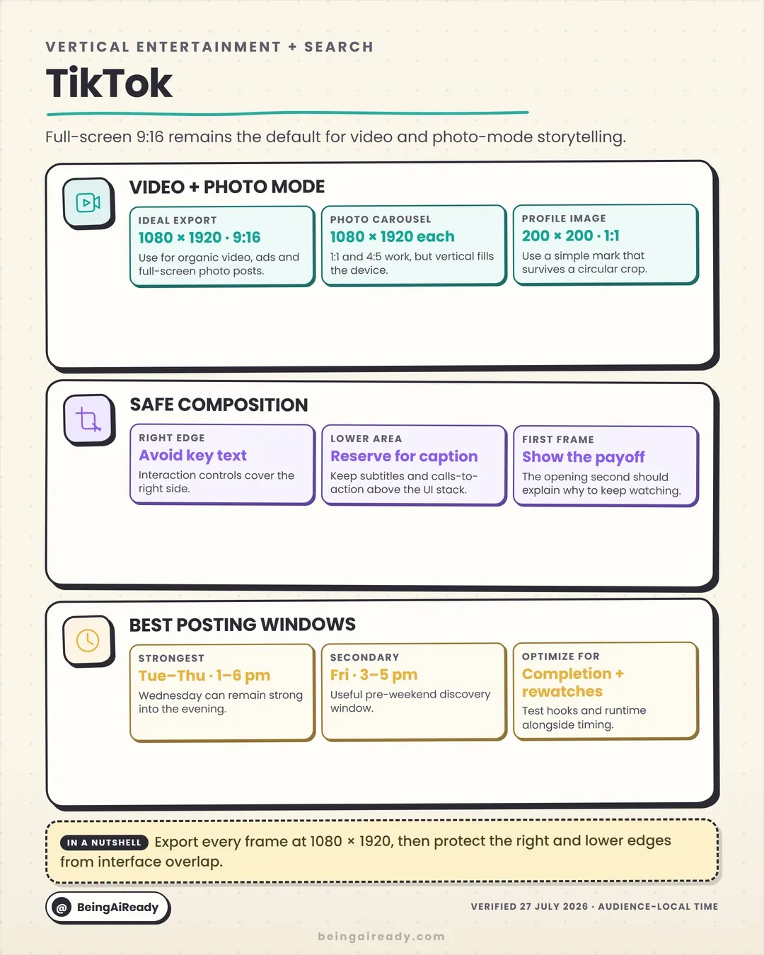
TikTok is built around a full-screen vertical viewer, so 1080 × 1920 px, 9:16 is the straightforward default for video and photo-mode posts alike. The hard part isn’t the canvas; it’s the interface. Interaction controls run down the right side; captions, audio and navigation crowd the bottom. A technically correct video becomes unreadable the moment your subtitles or call-to-action wander into those zones.
Recommended TikTok dimensions
| Asset | Recommended size | Ratio | Note |
|---|---|---|---|
| Organic video | 1080 × 1920 | 9:16 | Primary full-screen canvas |
| Photo-mode slide | 1080 × 1920 | 9:16 | Keep every slide consistent to avoid visual jumps |
| Cross-platform alt | 1080 × 1350 | 4:5 | Accepted, but doesn’t fill the vertical viewer |
| Profile image | 200 × 200 or larger square | 1:1 | Simple mark that survives a circular crop |
Keep the important words away from the right edge and the bottom caption stack. Put subtitles high enough to stay clear, but not so high they collide with the top labels. And the opening frame has to earn the next second. Not with bait; with a clear result, a bit of tension or a specific promise.
Best time to post on TikTok in 2026
Another clean example of credible studies disagreeing. Sprout finds strong engagement Tuesday through Friday, generally early afternoon into evening. Buffer’s July 2026 analysis of 7.1 million posts calls Sunday 9 a.m. the single best slot, with Saturday the strongest day overall.
Don’t average those into a mushy “post whenever”. Run a deliberate weekday-versus-weekend test instead:
- Weekday cohort: Tuesday–Thursday, 1–6 p.m.
- Weekend cohort: Saturday, 3–5 p.m., and Sunday around 9 a.m.
- Evening challenger: Friday around 6 p.m., or other 6–10 p.m. slots if your audience treats TikTok as wind-down entertainment.
Keep topic, length and quality roughly constant across the test, and read completion rate, average watch time, rewatches and shares long before you read likes.
Sources: Buffer’s social image sizes · Buffer’s TikTok timing study
X / Twitter image sizes, video ratios and best posting times
X is a real-time text network with increasingly loose media presentation, so the right format depends on the job of the post. A 1280 × 720 px landscape image suits news-style visuals, charts and previews. A 1080 × 1080 px square is compact and predictable. Vertical media can earn more mobile presence, but use it because the content benefits, not because another platform happened to use the same file.
Recommended X dimensions
| Asset | Recommended size | Ratio | Note |
|---|---|---|---|
| Landscape image | 1280 × 720 | 16:9 | Reliable for news, charts, summaries |
| Square image | 1080 × 1080 | 1:1 | Predictable and reusable |
| Portrait image | 720 × 1280 | 9:16 | Media-led posts; check the preview |
| Landscape video | 1920 × 1080 | 16:9 | Standard horizontal video |
| Vertical video | 1080 × 1920 | 9:16 | Keep it interface-safe |
| Profile image | 400 × 400 | 1:1 | Circular display |
| Header image | 1500 × 500 | 3:1 | Keep text off the profile overlap |
For multi-image posts, use one consistent ratio unless the contrast is deliberate. Mixed shapes create unpredictable layouts and can hand your most important image the least useful crop.
Best time to post on X in 2026
Buffer’s analysis of 8.7 million-plus posts finds a steady weekday-morning pattern, with Tuesday at 9 a.m. the strongest slot and Wednesday mornings just behind. Sprout finds a broad 12–6 p.m. Tuesday–Thursday window. That’s two tests, not one forced conclusion: run Tuesday–Thursday, 8–11 a.m. for news and commentary, and Tuesday–Thursday, 12–6 p.m. for discussion and reaction posts.
Topic velocity usually matters more than the calendar, though. Anything tied to a launch, an earnings call, a match or a breaking story should go out while the conversation is live. Waiting for a generic “best hour” is how a relevant post turns into an obsolete one. And measure replies, reposts, profile visits and link clicks separately; X can produce loud interaction with little site traffic, and occasionally the reverse.
Sources: X creative specifications · Buffer’s X timing study
LinkedIn image sizes, document posts and best posting times
LinkedIn gets treated as a text-only network, but its visual formats reward disciplined design. Portrait images use more mobile screen, document posts support structured multi-page explainers, and native video keeps getting more prominent.
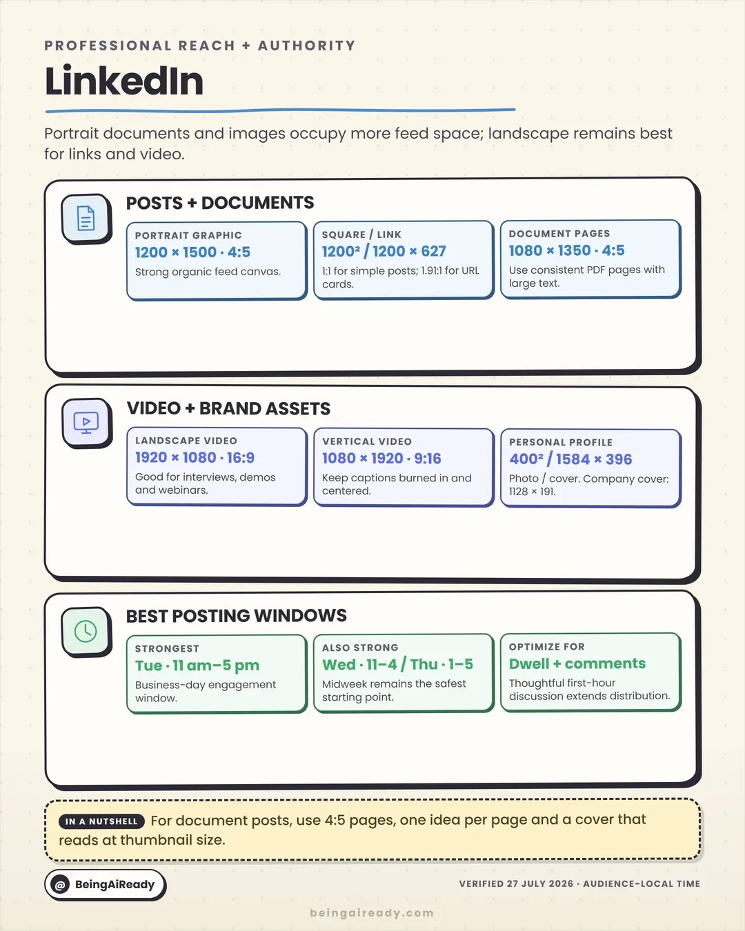
Use 1200 × 1500 px at 4:5 for a high-res portrait post, or 1080 × 1350 px when you’re sharing the same master with Instagram and Facebook. For document carousels, 1080 × 1350 px per page is a practical format that stays legible on a phone and can be designed in the same system as your other educational carousels.
Recommended LinkedIn dimensions
| Asset | Recommended size | Ratio | Note |
|---|---|---|---|
| Portrait image post | 1200 × 1500 or 1080 × 1350 | 4:5 | Strong mobile presence |
| Square image | 1200 × 1200 | 1:1 | Reliable single visual |
| Link preview image | 1200 × 627 | 1.91:1 | Articles and external pages |
| Document / PDF page | 1080 × 1350 | 4:5 | Big type, one idea per page |
| Vertical video | 1080 × 1920 | 9:16 | Keep the subject centrally safe |
| Landscape video | 1920 × 1080 | 16:9 | Interviews, demos, webinars |
| Personal profile photo | 400 × 400 | 1:1 | Circular |
| Personal background | 1584 × 396 | 4:1 | Keep text off the left-side profile overlay |
| Company cover reference | 1128 × 191 | ~5.9:1 | Responsive crops are unforgiving — preview |
A LinkedIn document should not be a slide deck exported without edits. Cut the words per page, enlarge the labels, and make sure every page reads on a phone without pinch-zooming.
Best time to post on LinkedIn in 2026
Sprout finds the strongest engagement on Tuesday, 11 a.m.–5 p.m., Wednesday 11 a.m.–4 p.m. and Thursday 1–5 p.m. Buffer’s 4.8-million-post analysis shifts a little later, clustering around 3–5 p.m. on weekdays, especially Wednesday and Thursday. The overlap is genuinely useful: start with Tuesday–Thursday, 11 a.m.–5 p.m., give 3–5 p.m. extra weight when you can only pick one slot, and for executive or industry commentary, publish while the topic is current rather than holding it for an “optimal” window.
Judge LinkedIn by qualified comments, saves, profile views, DMs, newsletter subscriptions and, where you can measure it, pipeline. Viral reach among people who will never buy from you is not automatically a business result.
Sources: Sprout’s LinkedIn timing study · Buffer’s LinkedIn timing study
Pinterest Pin sizes, video dimensions and best posting times
Pinterest behaves more like a visual search engine than a status feed. Content stays discoverable long after you post it, which makes format, keywords and seasonal lead time matter far more than a first-hour spike.
Pinterest officially recommends 1000 × 1500 px at 2:3 for standard Pins. Go taller than 2:3 and the feed may cut you off, even though the full asset survives once someone opens it.
Recommended Pinterest dimensions
| Asset | Recommended size | Ratio | Note |
|---|---|---|---|
| Standard Pin | 1000 × 1500 | 2:3 | Official recommended format |
| Square Pin | 1000 × 1000 | 1:1 | Fine, but less vertical feed space |
| Full-screen video | 1080 × 1920 | 9:16 | Immersive / Story-style |
| Standard vertical video | 1000 × 1500 | 2:3 | Keeps a consistent system with static Pins |
| Profile image | 280 × 280 reference | 1:1 | Simple circular-safe mark |
| Profile cover | 800 × 450 reference | 16:9 | Brand context, not dense information |
Write descriptive titles and descriptions. Pinterest uses that language to work out relevance even when the full description isn’t shown prominently, so a gorgeous Pin with weak text is simply harder to surface.
Best time to post on Pinterest in 2026
Sprout’s 2026 data points to useful windows Tuesday through Thursday, especially 8 a.m.–1 p.m., with some afternoon peaks. Start at Tuesday–Thursday, 10 a.m.–1 p.m., test early morning if your audience plans projects before work, and (this is the big one) publish seasonal content weeks or months ahead, not on the day. Judge Pinterest on saves, outbound clicks and downstream conversions. A Pin that quietly compounds search traffic for six months beats one that gets a brief burst of likes.
Sources: Pinterest product specifications · Sprout’s social timing study
Snapchat dimensions, safe zones and best posting times
Snapchat is a vertical, camera-native world, and the dependable canvas is 1080 × 1920 px at 9:16 for organic Snaps, Stories and most reusable ad production. Snapchat’s ad docs list 9:16 as required and give 720 × 1280 px as a floor, but 1080 × 1920 is the better target when you control the export.
Recommended Snapchat dimensions
| Asset | Recommended size | Ratio | Note |
|---|---|---|---|
| Snap or Story | 1080 × 1920 | 9:16 | Standard production canvas |
| Spotlight video | 1080 × 1920 | 9:16 | Full-screen vertical |
| Single-image / video ad | 1080 × 1920 target | 9:16 | Official minimum may be lower; export full-HD vertical |
| Public-profile photo | 320 × 320 practical target | 1:1 | Users can reposition and crop it |
| Public-profile cover | High-res landscape source | varies | No stable universal spec — preview in-app |
Leave generous room top and bottom, where the brand name, captions, reply controls and calls-to-action live. The middle third is the safe home for the main face, product and message.
Best time to post on Snapchat in 2026
Be honest about the evidence here: large-sample, transparent Snapchat timing research is thinner than it is for Instagram or TikTok, and a lot of published “best times” are practitioner benchmarks rather than platform-wide studies. So treat 6–9 p.m. audience-local as a reasonable first test for entertainment, lifestyle and community Stories, lean on weekends and after-school hours for younger audiences, and move to native analytics quickly. Story opens, frame-by-frame completion, exits, replies and shares will teach you more than any published average.
Sources: Snapchat ad formats · timing shown as a low-confidence operating hypothesis, not a universal result.
Threads image sizes, carousel limits and best posting times
Threads handles text, links, photos and video, and Meta’s docs currently allow up to 10 media items per post (with taller image support than most feeds). It’s visually flexible, but 3:4 and 4:5 portrait formats are the most useful for readable, media-led posts.
Use 1440 × 1920 px at 3:4 when you’re designing specifically for Threads, and 1080 × 1350 px at 4:5 when the same graphic is also going to Instagram, Facebook or LinkedIn.
Recommended Threads dimensions
| Asset | Recommended size | Ratio | Note |
|---|---|---|---|
| Threads-specific portrait | 1440 × 1920 | 3:4 | Strong tall format |
| Cross-platform portrait | 1080 × 1350 | 4:5 | Efficient shared master |
| Square image | 1080 × 1080 | 1:1 | Simple graphics |
| Landscape image | 1600 × 900 or 1200 × 675 | 16:9 | Charts, screenshots, link-like visuals |
| Vertical video | 1080 × 1920 | 9:16 | Keep the subject centred |
| Profile image | 640 × 640 reference | 1:1 | Shares lineage with the Instagram identity |
Keep ratios consistent across a sequence unless the change of shape is part of the story. A carousel that flips between tall and wide creates visual friction and unpredictable previews.
Best time to post on Threads in 2026
Buffer’s analysis of 2.5 million Threads posts calls Thursday at 9 a.m. the strongest single slot, with Wednesday noon and Wednesday morning close behind. Weekday mornings, roughly 7 a.m. to noon, are broadly useful. Start at Wednesday 9 a.m.–noon and Thursday 9–11 a.m., and for live cultural or industry moments, post while it’s unfolding. Threads is conversational; replies and follow-ups often matter more than treating the first post as a finished broadcast, so leave time to be in the thread.
Sources: Meta’s Threads documentation · Buffer’s Threads timing study
Bluesky image sizes, new media limits and best posting times
Bluesky’s media rules moved fast in 2026, so old size guides are worth double-checking. In April the platform raised the photo limit to 4000 × 4000 px and 2 MB; in June it expanded posts to up to 10 photos, added a redesigned carousel for larger sets, and pushed the video ceiling from 100 MB to 300 MB. Those are upload limits, not instructions to make everything square or enormous. For routine publishing, stick to efficient canvases.
Recommended Bluesky dimensions
| Asset | Recommended size | Ratio | Note |
|---|---|---|---|
| Portrait image | 1200 × 1500 | 4:5 | Explainers and mobile presence |
| Square image | 1200 × 1200 | 1:1 | Predictable in multi-image layouts |
| Landscape image | 1600 × 900 | 16:9 | Charts, screenshots, photography |
| Vertical video | 1080 × 1920 | 9:16 | Keep captions and subject centrally safe |
| Landscape video | 1920 × 1080 | 16:9 | Standard HD |
| Profile image | 1000 × 1000 target | 1:1 | Simple circular-safe identity |
| Banner | 3000 × 1000 target | 3:1 | Keep essentials centred |
Up to 10 photos can attach now, with the carousel treatment kicking in at five or more. That makes Bluesky good for step-by-step visual explainers, but it also raises an editorial question worth asking every time: does the tenth image add information, or just friction?
Best time to post on Bluesky in 2026
Buffer’s 2026 engagement report flags weekend evenings, 6–9 p.m., as a strong pattern, with Sunday around 5 p.m. the peak in its dataset. Treat that as a first test, not a law. Bluesky users pick their own custom feeds, and communities like science, journalism, art and regional groups run on their own clocks. Try Saturday/Sunday 5–9 p.m., a weekday window tuned to when your specific feed wakes up, and immediate posting for live news. Custom-feed pickup can matter more than raw home-feed reach.
Sources: Bluesky’s official releases · Buffer’s 2026 engagement report
Reddit image sizes, community assets and best posting times
Reddit isn’t one audience. It’s a pile of communities, each with its own rules, culture, time zone and tolerance for self-promotion. A technically perfect post gets removed in minutes if it breaks a subreddit’s rules or smells like an ad.
Use 1080 × 1350 px for a portrait infographic that needs mobile readability, 1200 × 1200 px for square images and 1200 × 628 px for landscape or link-like visuals. Presentation varies by post type and device, so keep key information central and the text un-tiny.
Recommended Reddit dimensions
| Asset | Recommended size | Ratio | Note |
|---|---|---|---|
| Portrait post image | 1080 × 1350 | 4:5 | Diagrams and explainers |
| Square post image | 1200 × 1200 | 1:1 | Predictable and reusable |
| Landscape image | 1200 × 628 | ~1.91:1 | Charts, news, links |
| Vertical video | 1080 × 1920 | 9:16 | Check subreddit support and preview |
| Landscape video | 1920 × 1080 | 16:9 | Standard horizontal |
| Community icon | 300 × 300 | 1:1 | Official spec |
| Community banner | 1080 × 128 reference | 8.4:1 | Keep it simple; responsive crops apply |
Read the subreddit rules before you design the post. Some require specific title formats, flair, source disclosure, original-content tags or a participation history; others ban links or commercial content outright.
Best time to post on Reddit in 2026
A single global Reddit time is the wrong abstraction, because the platform’s communities show wildly different geographic and circadian patterns. The right question is: when does this subreddit wake up? So review the community’s recent top posts and note when they went live, find the two-to-three-hour window where comments start accumulating, and publish 30–60 minutes before that window so your post can gather early votes and discussion. Then stick around to answer comments. With no data, a weekday morning is a reasonable provisional test for US-focused subs. Measure comment quality, vote ratio, saves, referral traffic and, above all, whether the mods let it stand. On Reddit, community acceptance is part of performance.
Sources: Reddit’s community-asset docs · Reddit banner help
Mastodon image sizes, attachment limits and best posting times
Mastodon is federated: people join different servers, follow across the network and mostly read chronological feeds, so universal growth advice is less reliable here than almost anywhere else. Its official docs (updated July 2026) allow up to four images per post, each up to 16 MB, downscaled to 8.3 megapixels (enough for a 3840 × 2160 image). Video and audio go up to 99 MB, with separate limits for animated GIF-style media.
Recommended Mastodon dimensions
| Asset | Recommended size | Ratio | Note |
|---|---|---|---|
| Portrait image | 1080 × 1350 | 4:5 | Readable mobile infographic |
| Square image | 1080 × 1080 | 1:1 | Illustrations and multi-image posts |
| Landscape image | 1920 × 1080 | 16:9 | Within the 8.3-megapixel processing ceiling |
| Vertical video | 1080 × 1920 | 9:16 | Mind file size and server processing |
| Landscape video | 1920 × 1080 | 16:9 | Compress to stay under the instance limit |
| Images per post | Up to 4 | — | Add a description to each |
Accessibility carries real cultural weight on Mastodon, so write meaningful alt text: the relevant information, not an inventory of every object. The editor also lets you set a focal point, which helps clients crop intelligently.
Best time to post on Mastodon in 2026
There’s no solid universal benchmark worth presenting as fact here, and I’d be a little suspicious of anyone who offers you one. Chronological feeds, different servers and geographic communities make follower-specific behaviour the thing that matters. Run two initial tests in follower-local time: 8–11 a.m., when people check in at the start of the day, and 6–9 p.m., when conversation picks up. Then track boosts, replies, follows and link visits. Hashtag use and server-level visibility often move reach more than the exact minute.
Source: Mastodon’s official media documentation · timing windows are low-confidence starting tests.
WhatsApp Status and Channel sizes, duration and best delivery times
WhatsApp isn’t a public feed, and that changes everything about timing: a notification carries a much higher interruption cost than a passive scroll. For Status, use 1080 × 1920 px at 9:16; per WhatsApp’s docs, Status updates take photos, GIFs and videos, disappear after 24 hours and currently allow videos up to 90 seconds. For Channels, 1080 × 1350 px works for portrait cards and 1080 × 1080 px for compact updates.
Recommended WhatsApp dimensions
| Asset | Recommended size | Ratio | Note |
|---|---|---|---|
| Status image or video | 1080 × 1920 | 9:16 | Full-screen mobile |
| Channel portrait card | 1080 × 1350 | 4:5 | Announcements and explainers |
| Channel square card | 1080 × 1080 | 1:1 | Simple notices |
| Profile image | 500 × 500 practical target | 1:1 | Circular display and compression |
| Status video duration | Up to 90 seconds | — | Shorter segments are easier to finish |
Keep Status text large, because people glance at it on a phone, fast, usually without sound. Break a dense announcement into a few clean frames rather than shrinking the type.
Best time to publish on WhatsApp
There’s no recommendation algorithm to game here; the aim is to reach people when the message is useful without wearing out your welcome. Use content-dependent windows: 7–9 a.m. for daily utility and reminders, 12–2 p.m. for quick updates people check on a break, 6–9 p.m. for community content that invites a reply. For business messaging, consent, relevance and frequency beat any marginal timing gain, so watch opt-outs, mutes and falling open rates as closely as you watch views.
Source: WhatsApp’s Status documentation · timing is operational guidance, not a platform-wide study.
Telegram channel sizes, Story dimensions and best delivery times
Telegram spans channels, groups, DMs, Stories and file sharing, so a single “ideal image size” would mislead. For channel cards, 1080 × 1350 px gives text-heavy posts a readable portrait; use 1280 × 720 px for landscape media and 1080 × 1080 px for compact visuals, with Stories at 1080 × 1920 px. Telegram Stories can run 6, 12, 24 or 48 hours, and file-mode delivery is handy when the recipient needs the original asset rather than a compressed preview.
Recommended Telegram dimensions
| Asset | Recommended size | Ratio | Note |
|---|---|---|---|
| Channel portrait card | 1080 × 1350 | 4:5 | Educational and announcement posts |
| Square post | 1080 × 1080 | 1:1 | Concise visuals |
| Landscape post | 1280 × 720 | 16:9 | Video, screenshots, previews |
| Story | 1080 × 1920 | 9:16 | Full-screen mobile |
| Profile image | 512 × 512 target | 1:1 | Circular display |
| Exact-pixel asset | Send as a file | — | When recipients need the original, not a photo |
Best time to publish on Telegram
Telegram is notification-sensitive, so a “technically optimal” schedule that annoys subscribers is a bad schedule. Start with 8–10 a.m. for news and utility, 12–2 p.m. for short updates and 6–9 p.m. for community discussion. Segment channels where you can. A breaking-news feed and a weekly learning channel should not share a cadence. Track 24-hour views, link clicks, reactions, forwards and unsubscribes; the spacing between posts can matter as much as the hour.
Sources: Telegram Stories · Telegram FAQ
Discord server sizes, shared media and best announcement times
Discord is a participation platform, not a discovery feed. Whether an announcement lands depends on whether members are around and willing to respond, not on a ranking algorithm handing you an early boost. Discord recommends a 960 × 540 px, 16:9 server banner (keep the top ~48 px quiet so the title stays readable), with a 128 × 128 px minimum server icon, though a 512 × 512 px source gives you cleaner scaling.
Recommended Discord dimensions
| Asset | Recommended size | Ratio | Note |
|---|---|---|---|
| Server icon | 512 × 512 source; 128 × 128 min | 1:1 | Simple mark that survives small display |
| Server banner | 960 × 540 | 16:9 | Keep the top 48 px visually quiet |
| Event cover | ≥ 800 × 400 target | 2:1 | Preview in the composer; crops vary |
| Shared landscape graphic | 1200 × 675 | 16:9 | Announcements, embeds, screenshots |
| Shared portrait graphic | 1080 × 1350 | 4:5 | Mobile-readable rules and schedules |
Don’t bury a full paragraph inside an announcement image. Discord users can read text in the message body, where it’s searchable, accessible and copyable. Use the image for hierarchy and recognition, then put the operational details in text.
Best time to post on Discord
Use Server Insights, event attendance and member geography rather than a global average. For work, education or professional servers, test announcements Tuesday–Thursday around 9–11 a.m. or 2–4 p.m.; for gaming, creator and social communities, 6–9 p.m. tends to fit better. Send event reminders before the participation window, not at the moment it starts. And measure whether members keep asking questions the announcement should have answered. Clarity is part of performance.
Sources: Discord server banners · Discord server icon guidance
Twitch stream dimensions, channel assets and best go-live times
Twitch’s dual-format streaming now lets creators send horizontal and vertical versions of the same broadcast, which changes production planning: the vertical version shouldn’t be a cropped slice of a busy desktop scene. Use 1920 × 1080 px at 16:9 for the horizontal stream and 1080 × 1920 px at 9:16 for the vertical companion, designing each around its own context.
Recommended Twitch dimensions
| Asset | Recommended size | Ratio | Note |
|---|---|---|---|
| Horizontal live stream | 1920 × 1080 | 16:9 | Standard live and VOD canvas |
| Vertical companion | 1080 × 1920 | 9:16 | Build a separate mobile composition |
| VOD thumbnail | 1280 × 720 | 16:9 | One clear subject, short readable text |
| Profile image | 256 × 256 reference | 1:1 | Keep it simple |
| Profile banner | 1200 × 480 reference | 2.5:1 | Protect central branding from crops |
| Offline screen | 1920 × 1080 | 16:9 | Show the next stream or schedule |
| Info panel | ≤ 320 px wide; 600 px high max | varies | Twitch resizes larger; keep files under 1 MB |
Best time to go live on Twitch
Generic platform-wide times are less useful on Twitch, because category competition shifts through the day. A big category has more viewers at peak, but also far more established channels fighting over them. So identify when your category’s viewership starts rising, go live 30–60 minutes before the busiest period, and compare average concurrent viewers, unique chatters, follows-per-hour and retention across several streams. With no data, test Tuesday–Thursday 6–10 p.m. local and a weekend 10 a.m.–2 p.m. session, treating both as exploration windows rather than gospel. Consistency is what turns a viewer into a regular.
Sources: Twitch dual-format streaming · Twitch info panels
Tumblr image sizes, video limits and best posting times
Tumblr’s value is in reblogs, tags, fandoms and long circulation. A post can resurface weeks after you make it, so readability and tagging matter more than a perfect first-hour crop. Tumblr’s docs distinguish dashboard display (commonly around 540 × 810 px) from the larger version available after opening an image (up to 2048 × 3072 px). A 1280 × 1920 px, 2:3 master is a sensible compromise: enough detail for the larger display without becoming needlessly heavy.
Recommended Tumblr dimensions
| Asset | Recommended size | Ratio | Note |
|---|---|---|---|
| Practical portrait master | 1280 × 1920 | 2:3 | Good detail-to-weight balance |
| Max large-image reference | Up to 2048 × 3072 | 2:3 | Official larger-version ceiling |
| Square image | 1280 × 1280 | 1:1 | Art, quotes, photo sets |
| Header image | 2048 × 1152 | 16:9 | Official ideal; keep focal content central |
| Avatar | 128 × 128 reference | 1:1 | Simple identity at small size |
| Landscape video | 1920 × 1080 | 16:9 | Standard HD |
| Vertical video | 1080 × 1920 | 9:16 | Phone-native clips |
| Direct-upload video | Up to 10 min / 500 MB | — | Current official limit |
Tumblr supports big files, but don’t dump unoptimised source art by default. Export at a quality that keeps gradients and linework intact without forcing every reader to download a monster file.
Best time to post on Tumblr
Transparent, current platform-wide timing research is thin, so use 5–8 p.m. audience-local as an initial test, then replace it with dashboard and community observation. Fandom timing overrides the baseline constantly, so post near episode drops, game updates, concerts and announcements, when people are already searching and tagging the subject. Use accurate tags rather than stuffing popular unrelated ones, and measure reblogs, tag discovery, follows and the long tail over days rather than minutes. Tumblr performance is cumulative more than immediate.
Sources: Tumblr’s image guidance · Tumblr’s video limits
A cross-platform workflow that doesn’t destroy the work
The most efficient workflow is not “create once, auto-post everywhere.” That saves export time and quietly wrecks half your posts. The better version is create once at the concept level, then adapt deliberately at the placement level.
1. Start with the job of the asset. A carousel teaches a sequence; a thumbnail earns a click; a Story supports a quick full-screen interaction; a link card represents a webpage; a banner communicates identity. The same sentence should not be forced to do all of those.
2. Keep an editable, high-resolution master. Don’t let your first platform export become your only working file. A folder that separates source, copy, the design master, per-ratio exports and results will save you every time a platform changes its grid:
campaign-name/
  01-source/
  02-copy/
  03-design-master/
  04-exports/
    4x5-feed/
    9x16-vertical/
    16x9-video/
    1x1-square/
    1.91x1-links/
  05-published/
  06-results/
Name the exports by campaign, platform, format and version, not final-final-2.png:
ai-tools-guide_instagram-carousel_1080x1350_v03.png
ai-tools-guide_reel-cover_1080x1920_v02.png
ai-tools-guide_linkedin-document_1080x1350_v01.pdf
3. Design the 4:5 feed master first, keeping the headline, logo and key object inside a roughly 1080 × 1080 centre. Backgrounds and decoration can run to the edges. Then check the first carousel page at feed-thumbnail size. If the promise isn’t legible without zooming, it’s too dense.
4. Recompose for 9:16 instead of stretching it. A 4:5 graphic doesn’t become a good Story by adding empty space. Move the headline into the upper-middle, reserve the bottom for captions and controls, keep the right edge clear, reframe faces for a narrow viewport, size up the subtitles, and test the opening frame with the sound off.
5. Treat thumbnails and covers as packaging, not decoration. A good cover usually needs one clear promise, one focal subject, strong contrast, very few words, no reliance on a tiny logo, and a crop that survives mobile preview. Don’t just repeat the title word-for-word if a shorter visual promise will do.
6. Export with restraint. PNG for line art, screenshots and text-heavy graphics; high-quality JPEG or WebP for photography and gradients; sRGB for predictable colour. Check the small text after export, not just in the design tool. For video, H.264 in MP4 stays broadly compatible. Avoid re-transcoding across five apps, and check dialogue clarity on a real phone speaker.
7. Preview the real placement. The feed crop, the profile-grid crop, the Story interface, the desktop and mobile banner, dark mode, the link preview, the first frame before playback, the post at typical phone brightness. Automated placement tools save time; they don’t take the blame for a logo cut in half.
8. Add accessibility before publishing. Meaningful alt text, captions on video, decent contrast, no message trapped entirely inside an image, charts explained in the copy, no rapid flashing. Alt text should carry the relevant information (for a chart, that’s the conclusion and the key numbers), not an inventory of decorative shapes.
If you’re leaning on AI to speed up the resizing step, that’s a legitimate use, so long as you keep a human in the loop. We go deeper on where that helps and where it quietly breaks things in our roundup of underrated AI tools for content creators.
How to find your own best posting time in four to six weeks
The goal isn’t a mystical perfect minute. It’s to reduce uncertainty enough to build a schedule you trust.
Step 1: Pick one outcome. Don’t optimise every metric at once. Educational carousel? Saves per reach and qualified shares. Product announcement? Landing-page visits and conversions. Video? Click-through and watch time. Community post? Replies from relevant members. Likes can ride along, but they shouldn’t be the deciding vote.
Step 2: Choose two or three windows. A benchmark and a credible challenger. An Instagram account might test Tuesday 3 p.m., Wednesday 6 p.m. and Thursday 9 a.m. A Facebook Page might compare Wednesday 1 p.m., Wednesday 6 p.m. and Thursday 9 a.m.
Step 3: Keep the content comparable. Don’t publish your best launch at one time and filler at another, then declare the launch time the winner. Spread comparable posts across the windows and tag them by topic, format, length, quality and whether they carry an offer.
Step 4: Run it long enough. Four to six weeks is a practical minimum for accounts posting several times a week; lower-frequency accounts need longer. One post is an anecdote. Five is still vulnerable to creative differences. You’re after enough repetition to stop reacting to noise.
Step 5: Record first-hour and long-tail. Timing often moves the first hour without moving the final result, so log both. A simple sheet does the job:
| Field | Example |
|---|---|
| Platform | |
| Date and audience-local time | Tuesday, 3:00 p.m. |
| Format | 8-page carousel |
| Reach after 2 hours | 4,200 |
| Reach after 7 days | 18,700 |
| Saves | 940 |
| Shares | 310 |
| Meaningful comments | 26 |
| Link clicks | 73 |
| Notes | Strong cover; page 5 had a correction |
Step 6: Normalise the metric. Raw totals flatter posts with more reach, so compare rates: save rate (saves ÷ reach), share rate, click-through, completion (completed ÷ starts), follow conversion (follows ÷ profile visits). Don’t over-engineer it; the point is comparing like with like.
Step 7: Turn the winner into a schedule, not a rule. Pick a primary time, a backup and one experimental slot, and keep testing. School terms, holidays, daylight-saving, product cycles and geographic growth all shift the pattern. Re-check at least quarterly, and after any big change in format or audience.
The mistakes I see most often
- Using one 9:16 file everywhere. Vertical is widely supported; that doesn’t make it right for every feed, link preview or desktop context. Recompose for 4:5 and 16:9 instead of trusting automatic crops.
- Putting text against the edges. Interface overlays are predictable in principle and fiddly in detail. A generous central safe zone beats a template with a supposedly exact 74-pixel margin.
- Designing at full size only. It can look elegant at 100% zoom and collapse as a thumbnail. Review it at the size people first meet it.
- Confusing file limits with recommended dimensions. A platform accepting a 4000 × 4000 image doesn’t mean every post should be one. Ceilings answer “what can I upload,” not “what should I design.”
- Treating paid and organic specs as identical. Ad systems add placement groups, calls-to-action and automated cropping that organic posts don’t share. Use the live ad preview for the campaign you’re actually buying.
- Posting at a benchmark time without checking time zones. “9 a.m.” is meaningless unless the study normalises the time or names a region. Convert to the audience’s local clock, not the social manager’s laptop.
- Optimising for likes alone. They’re easy to see and weakly connected to the goal. Educational content should earn saves; product content should earn qualified visits; video should hold attention.
- Changing too many variables at once. A different topic, format, hook, length, thumbnail and time can’t tell you which one moved the number. Social experiments will never be lab-clean, but they can be less careless.
- Ignoring community rules. On Reddit, Discord, Mastodon instances and niche groups, culture is part of distribution. Respecting the community isn’t a soft branding nicety; it’s a functional requirement.
- Never updating the guide. Platforms change previews, limits and layouts constantly. Keep the editable masters and re-check specs every quarter. This one was verified through July 2026; it isn’t permanent, and neither is any other.
The durable rule: standardise the workflow, not the post
Platforms will keep redesigning their layouts. New video surfaces will appear, grids will get rebuilt, upload limits will climb, and the timing studies will keep disagreeing. None of that is a reason to freeze.
The stable advantage is an adaptable production system: keep editable, high-resolution masters; build around 4:5, 9:16, 16:9 and 1.91:1; protect the central safe areas; preview the real placement; keep technical specs separate from performance hypotheses; test posting windows against outcomes that actually matter; and update the reference every quarter.
Correct dimensions won’t make weak content compelling, and a perfect posting time won’t manufacture demand. What they do is clear away avoidable friction, so a good idea gets a fair shot at being seen, understood and acted on. That’s the honest bar for social media work: sound production choices, measured against what your audience really does, rather than ritual or false precision.
A note on sources: media specs here prioritise official platform documentation where it exists, backed by current 2026 references from Buffer and Hootsuite for the dimensions platforms don’t publish cleanly. Posting-time recommendations draw on 2026 studies from Sprout Social and Buffer for the major ranked networks. For messaging, federated and community-led platforms where transparent global timing evidence is limited, the suggested hours are labelled as low-confidence operating tests, so lean on native analytics, community behaviour and audience-local time. Verified as of July 2026; re-check identity assets and paid-ad specs inside each platform before a major campaign.
Frequently asked questions
What's the best all-purpose social media image size?
For a portrait feed graphic, 1080 × 1350 (a 4:5 ratio) is the one to reach for first. It looks right on Instagram, Facebook, LinkedIn, Threads and X, and it eats more phone screen than a square as someone scrolls past. Just keep the logo and headline inside a centred square so nothing important gets chopped when a platform crops back to 1:1. There's no single size that covers every placement, though: full-screen vertical is 1080 × 1920, landscape video is 1920 × 1080, and link cards are 1200 × 630.
Is 1080 × 1350 really better than 1080 × 1080?
For grabbing attention in a mobile feed, usually yes, because the taller 4:5 frame takes up more screen. Square still earns its keep for profile-grid consistency, multi-image posts, and anywhere one file has to behave predictably everywhere. It's a composition call, not a law.
What size should a YouTube thumbnail be in 2026?
YouTube now recommends 3840 × 2160 (16:9), with a 640-pixel minimum width. Don't read 'bigger file' as 'cram more in', though. The thumbnail still has to make sense at fingernail size on a phone. One face, a few words, strong contrast. The big canvas is about staying crisp after compression, not about detail nobody can see.
What's the best size for Reels, TikTok, Shorts and Stories?
1080 × 1920, 9:16, across all of them. The hard part isn't the canvas, it's the edges: every one of these apps stacks its own buttons and captions down the right side and along the bottom. Keep your key text and faces in a central band, and preview inside the app before you schedule anything.
What's the best time to post on social media?
There isn't one, and anyone selling you a single magic hour is selling certainty that doesn't exist. As a broad starting point, Tuesday and Wednesday from late morning into the afternoon tend to be strong. But the specifics flip by platform: Sunday mornings suit long-form YouTube, Friday evenings suit Shorts, weekday mornings suit X. Pick a benchmark window from the relevant section, run it for a few weeks, then let your own analytics overrule it.
Should I post at exactly the peak hour?
Not really. A broad active window beats a precise minute almost every time, because the minute is mostly noise. The two exceptions are scheduled premieres and live streams, where showing up a little before the peak helps people arrive, and breaking news, where being relevant beats being punctual.
Which metric should decide my best posting time?
Whatever matches the job of the post. Saves and shares for reference content, clicks and conversions for anything selling, watch time and completion for video, real replies for community posts, attendance for events. Likes are the easiest thing to count and usually the least useful signal, so don't let them run the schedule on their own.
Can I just use AI to resize one design for every platform?
For the mechanical part, yes, and it's a real time-saver. AI tools will extend backgrounds, reframe a subject and produce placement variants in seconds. What they won't reliably catch is that the logo now sits under the TikTok caption stack, or that the headline got cropped out of the link preview. Let automation handle the repetitive resizing, then have a person check the crop, the hierarchy and the safe zones before it ships.
Related articles
The Chrome Extensions Actually Worth Installing in 2026
Every 'best extensions' list recommends the same five tools. Here are 32 underrated Chrome extensions organized by profession, from students to job seekers.
Best AI Scheduling & Calendar Tools in 2026 (Reclaim and Alternatives)
A practical comparison of the best AI scheduling tools and calendar apps in 2026, including Reclaim, Motion, Morgen, Calendly, Akiflow, SkedPal, Trevor AI, and Sunsama.
24 Underrated AI Tools for Content Creators in 2026
Skip the five AI tools every list recommends. Here are 24 lesser-known ones solo creators actually use, organized by where they fit your workflow.